
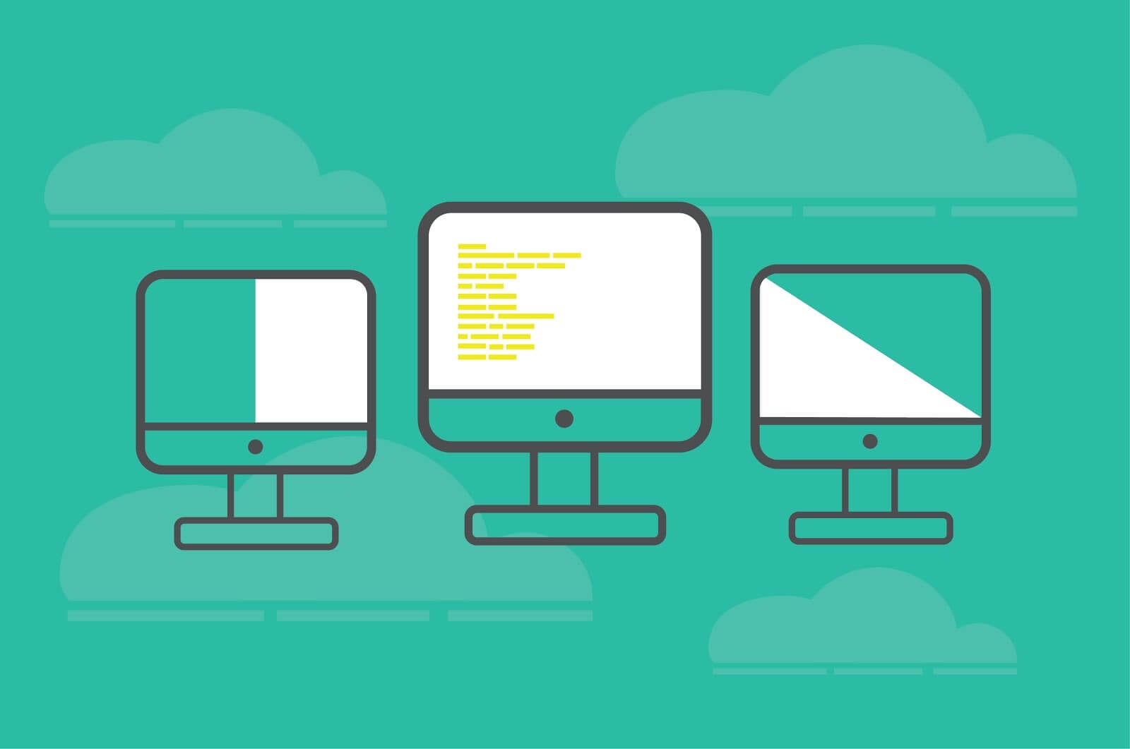
User Experience design improves our interactions with digital products. It is an interdisciplinary field that encompasses, among others: visual design, IA (Information Architecture), content strategy, or even cognitive psychology (how we perceive, remember, and what we pay attention to). Take a look at 6 page layouts that will improve User Experience and take your web design to a whole new level.
Why is UX important?
The goal of User Experience designers is to generate positive emotions through product interactions. Imagine you want to buy a present for your friend, but the company’s website has a chaotic layout and the navigation is so bad that it’s difficult to quickly find the T-shirt you want to purchase. You get annoyed and, as a result, abandon the page and look for the product somewhere else.
A well designed website will satisfy the users’ functional needs (e.g. finding information about the product, making an order) and psychological needs (e.g. saving time, making your friend happy with the present). At the same time, it will meet the company’s business needs (e.g. keeping customers loyal to the brand, higher conversion rate and volume of sales).
Make a great first impression with visual design
Let’s take a look at some statistics. Studies show that it takes 7 seconds to form an opinion about a newly met person. Websites have only 50 milliseconds (that’s 0.05 seconds!) to make a good first impression.
According to the Web Credibility Project conducted by Stanford University (based on three years of research and interviews with over 4,500 people), we quickly assess the overall visual design of a website.
If it looks professional, visitors perceive the page owner as more credible, which, in turn, may lead to higher conversion rates. Typography, layout, font size and color schemes are the key elements you should consider in your web design project.
We may say that UX designers are both artists and scientists. They focus not only on performance, usability and the overall human-machine interaction but also on design and aesthetics.
6 types of website layouts that will improve User Experience:
1) Full screen photo
One image is worth a thousand words. A full screen photo immediately attracts the user’s attention and is one of the best ways to present the products or services a company offers.
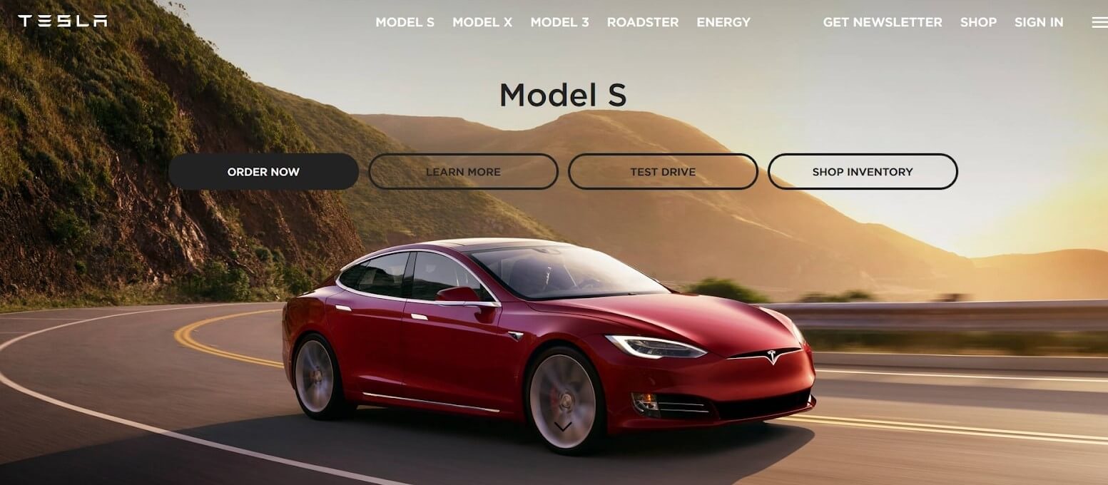
Source: https://www.tesla.com/
Use a full screen photo to present your products in an attractive way.
A full screen photo is the perfect solution if you want to say less and show more.
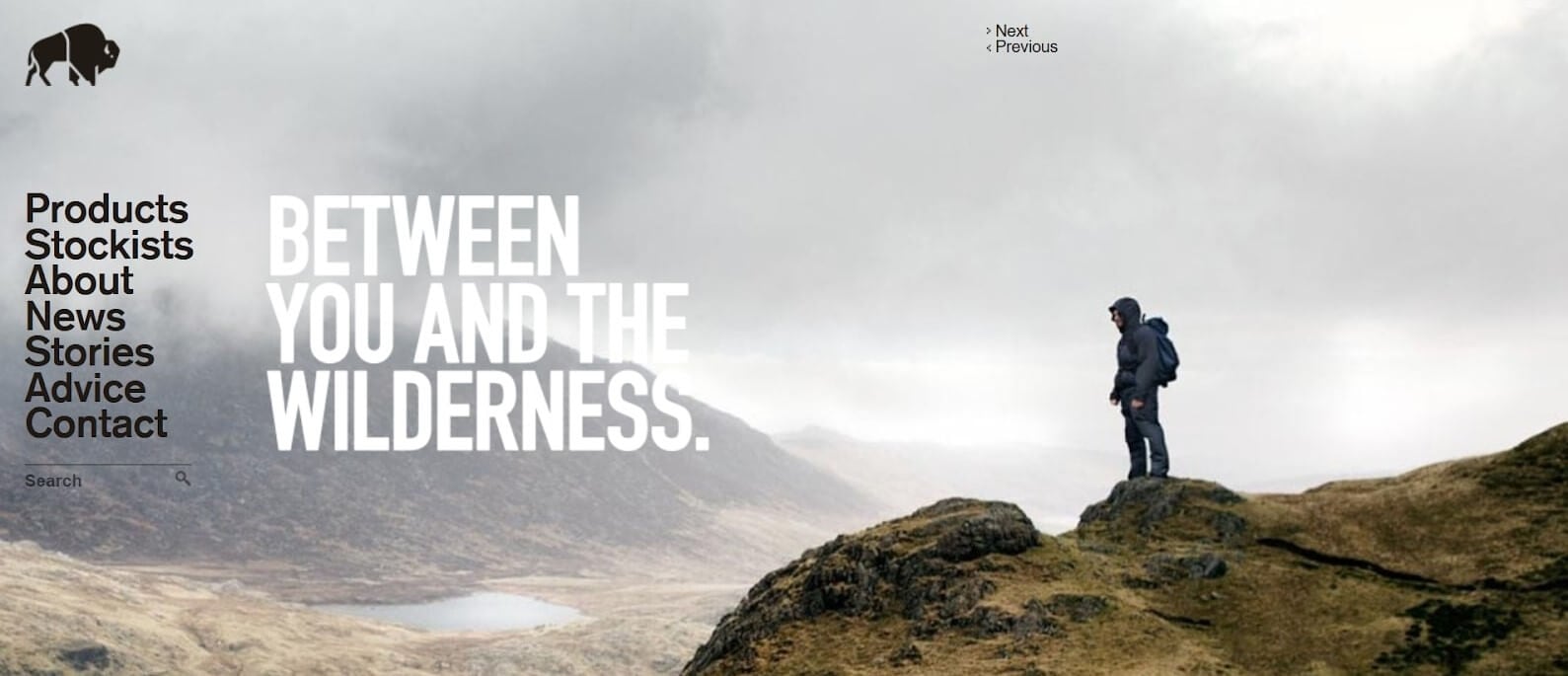
Source: http://www.buffalosystems.co.uk/
This website belongs to a British brand that produces high quality outdoor clothing.The photograph perfectly harmonizes with the brand’s image.
Design tips:
-
-
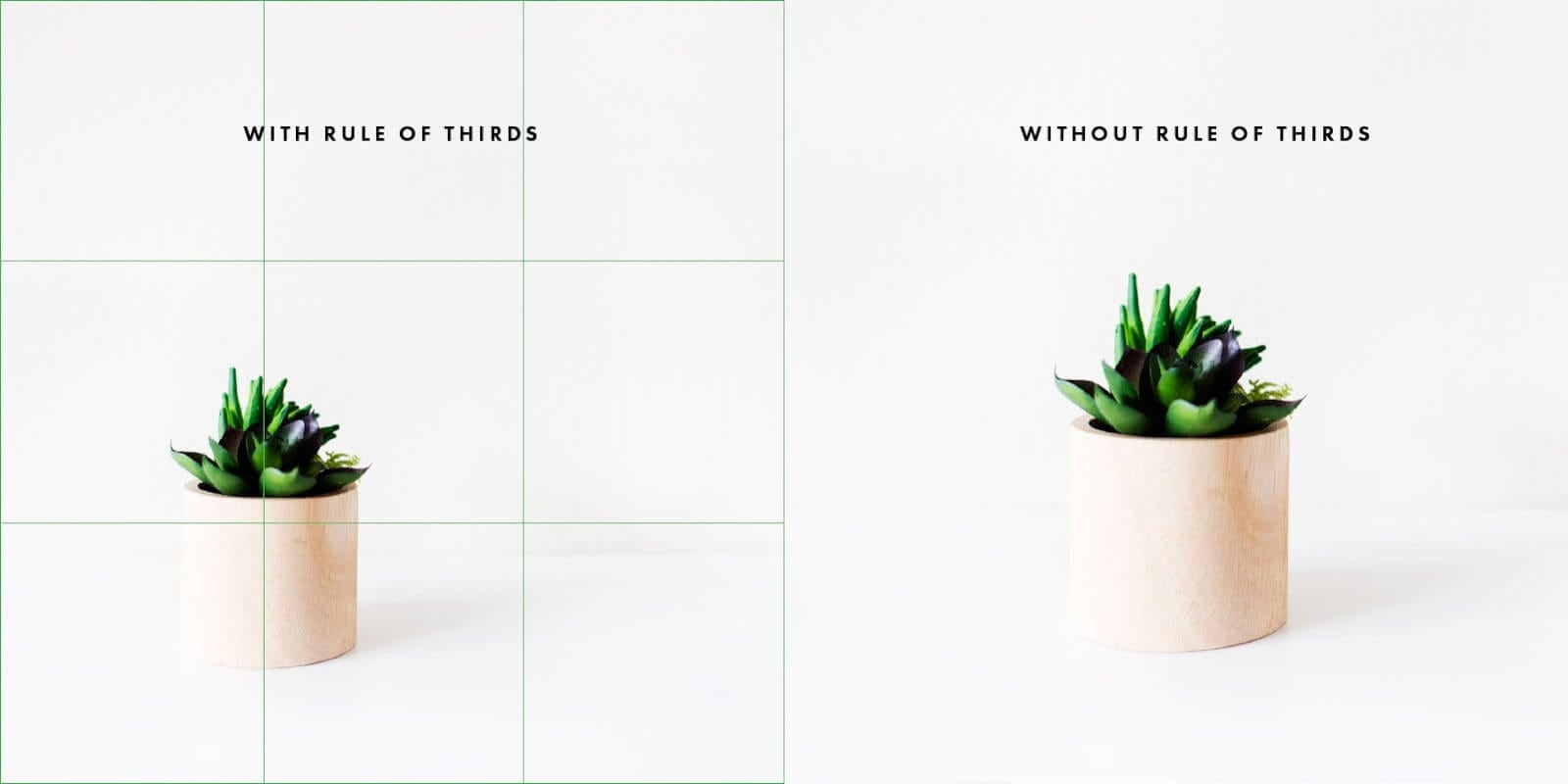
- Remember about the rule of thirds. It says that if you equally divide your photograph with 2 horizontal and vertical lines, the most important thing should be placed at the points where these lines intersect. So, instead of putting the subject directly in the center, place it more to one side. This will create a stronger feeling of motion and draw the user’s eye to the subject.
-
Source: http://www.itspinkpot.com/rule-of-thirds-instagram/
Illustration of the rule of thirds.
- Be careful when choosing the background photograph. Make sure that it is consistent with the brand’s communication and visual identity.
- Combining your photograph with a CTA (Call-To-Action, e.g. Explore, Learn More) will add a persuasive effect, evoking the user’s response.
2) Split screen
A split screen layout means that it is divided into two or more vertical parts. It allows you to present different items of equal importance on one page. You can show products, services, or payment options in a clear and organized way.
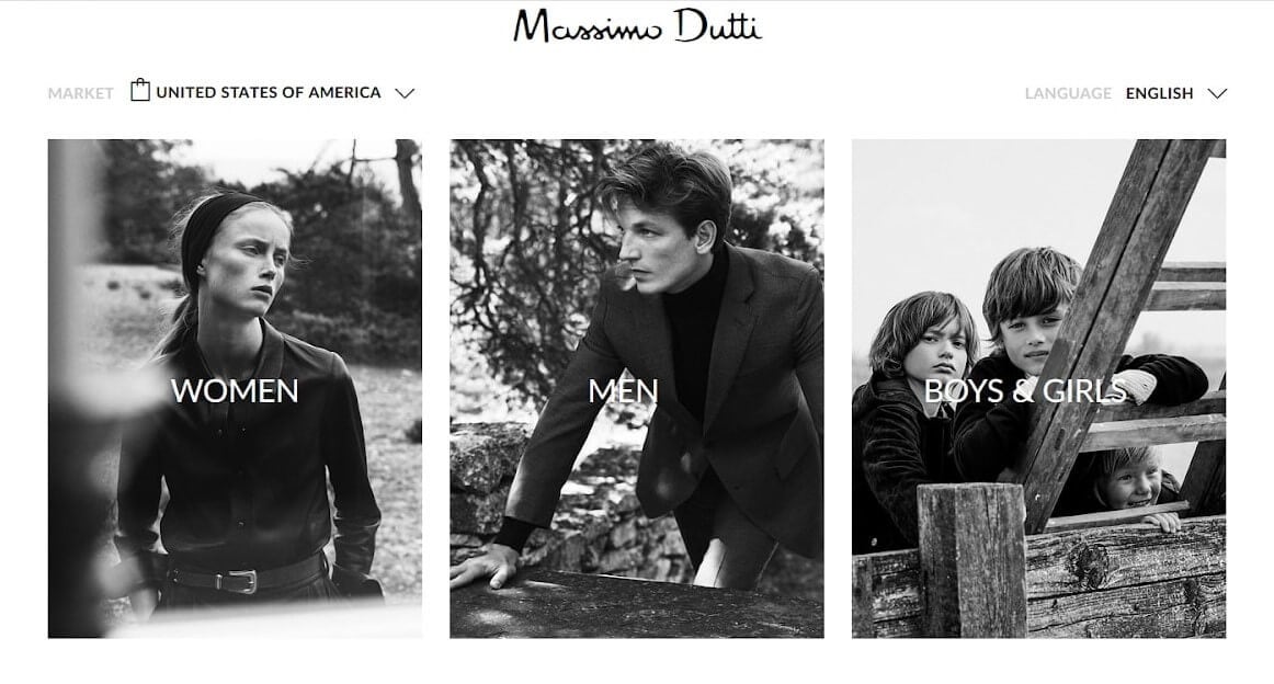
Source: https://www.massimodutti.com/
Clean and comfortable to use split screen layout.
This type of layout is perfect for a landing page, which shows different side-by-side options.
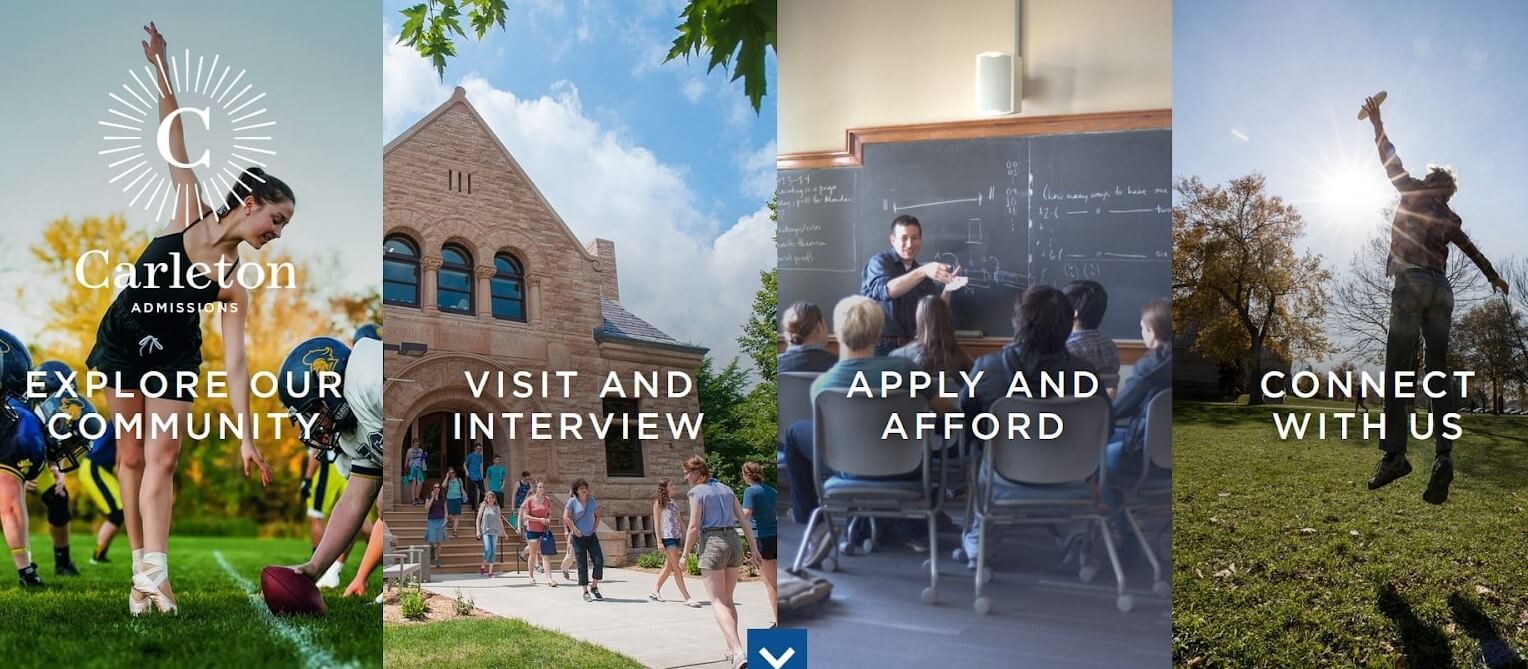
Source: https://www.carleton.edu/admissions/
This website offers different directions for a user’s journey.
Design tips:
- Don’t exaggerate with the number of items.
- Keep the split screen layout simple. Make it easy for the user to choose between the options.
3) Asymmetrical layout
Asymmetry means that the layout is divided into unequal parts. How many times have you seen websites that consist of a small text column and a large photograph next to it? Probably quite often, since the asymmetrical layout is one of the most frequently used web designs.
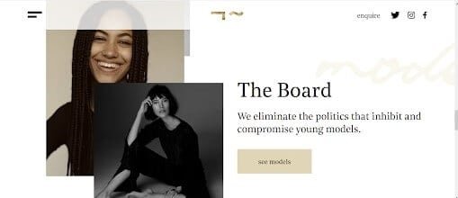
Source: https://lindenstaub.com/
Beautiful asymmetrical layout used by Linden Staub, a modelling agency.
This type of layout allows to pair text with images. Photographs or graphic designs complement the text, illustrating it’s main message and making it easier to remember. At the same time, images have a decorative function and drag the user’s attention.
Asymmetry is also a great way to add dynamism, especially if you divide the composition diagonally.
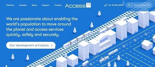
Source: https://www.access-is.com/
This company produces technology that facilitates public transport. The diagonal division creates a dynamic composition.
Another advantage of asymmetry is that it’s visually engaging. Since the main elements are placed in a non-centered way, it facilitates better scanning behavior by guiding our eyes from one element to another.
Design tips:
- Since asymmetry adds eye-catching dynamism, it works best with minimalist layouts.
4) Grid of cards
Grids of cards are frequently used by e-commerce and social media sites (e.g. Facebook, Pinterest, Youtube). This type of layout consists of grids with clickable cards, which allow you to serve up information in small, digestible parts. That’s why they are a perfect choice for content-heavy websites.
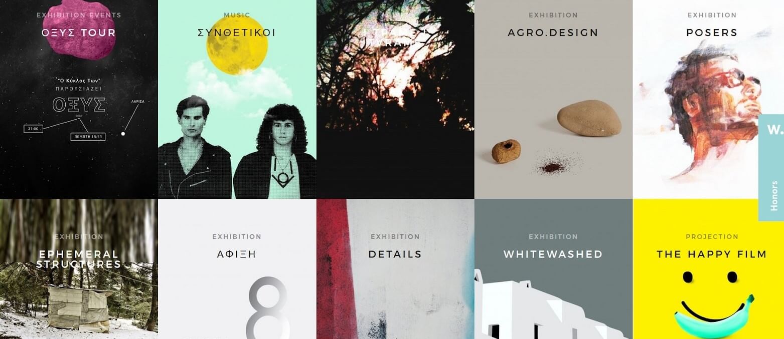
Source: https://www.wisedog.gr/
A grid of cards allows to present a large amount of content in a simple way.
A grid of cards organizes information in small boxes, making it easy to read and scan. Visitors can easily choose the content they like and find more information about it by simply clicking on the box. Container-style design also gives websites a clean and minimalistic look.
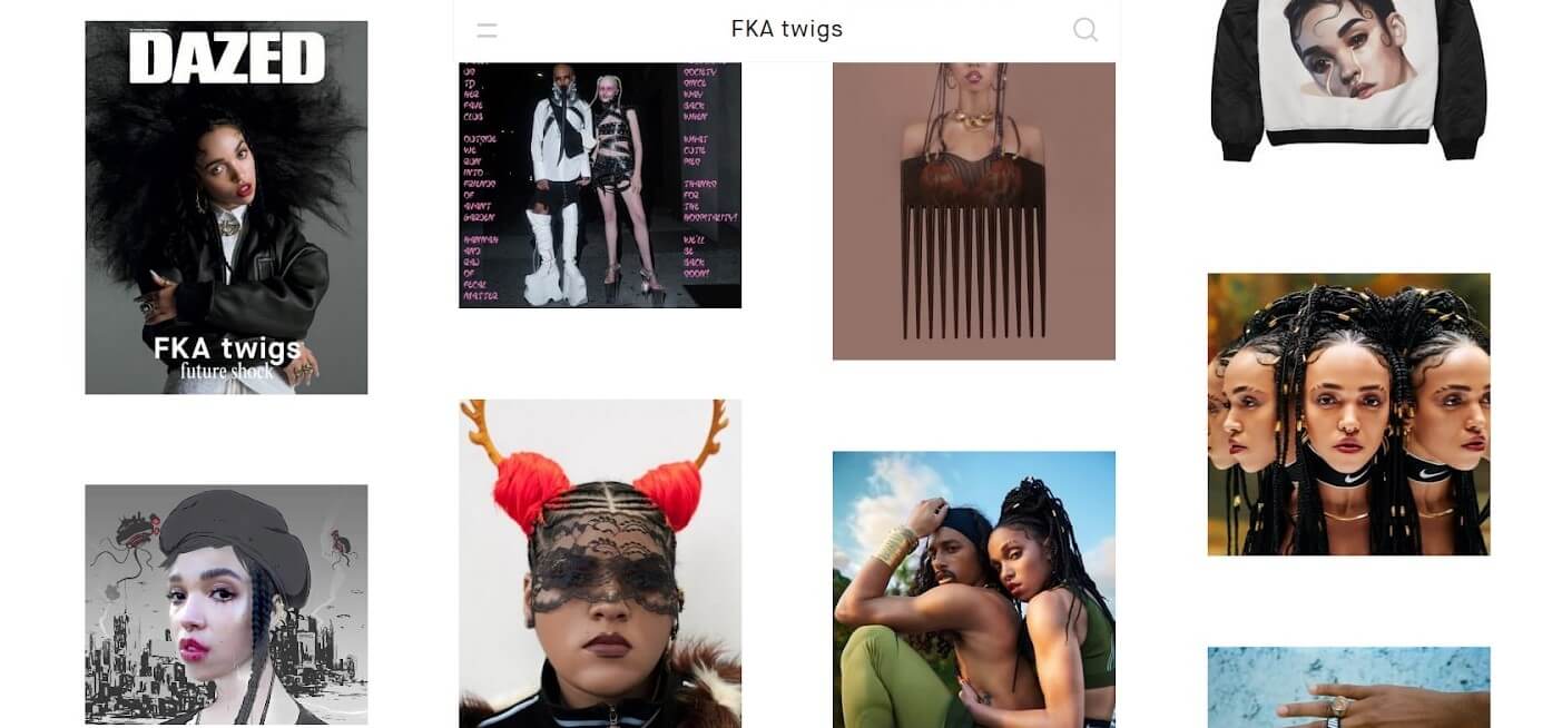
Source: https://fkatwi.gs/
A grid of cards will work as good on a mobile phone and tablet screen, as on a large-sized computer monitor.
One of the major advantages of the grid of cards layout is that it’s compatible with responsive frameworks. This means that the small boxes of content can be suited for all types of screen sizes.
Design tips:
- Make the entire card clickable, not just the image or text. This will make it easier for users to click on the content of their choice.
- Choose the appropriate width of white spaces between the cards. Larger spaces will slow down scrolling and focus the user’s attention. Smaller spaces enable faster scanning but increase the risk that the user will overlook some content.
5) Fixed menu bar
Website navigation is one of the most important aspects of User Experience and a fixed menu bar will definitely improve it. Fixed elements stay in their place, while the rest of the content moves as you scroll. No matter how far down the page you go, a fixed menu bar will always be at the reach of your hand.
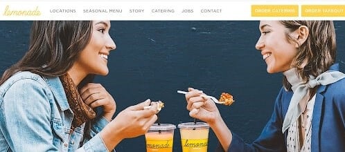
Source: https://www.lemonadela.com/
As you scroll this page, the menu bar will move down with you.
There are countless ways to design fixed elements – they can shrink and expand at the click of a mouse, appear in the consecutive sections of a page, or be glued to one of the corners of your screen.
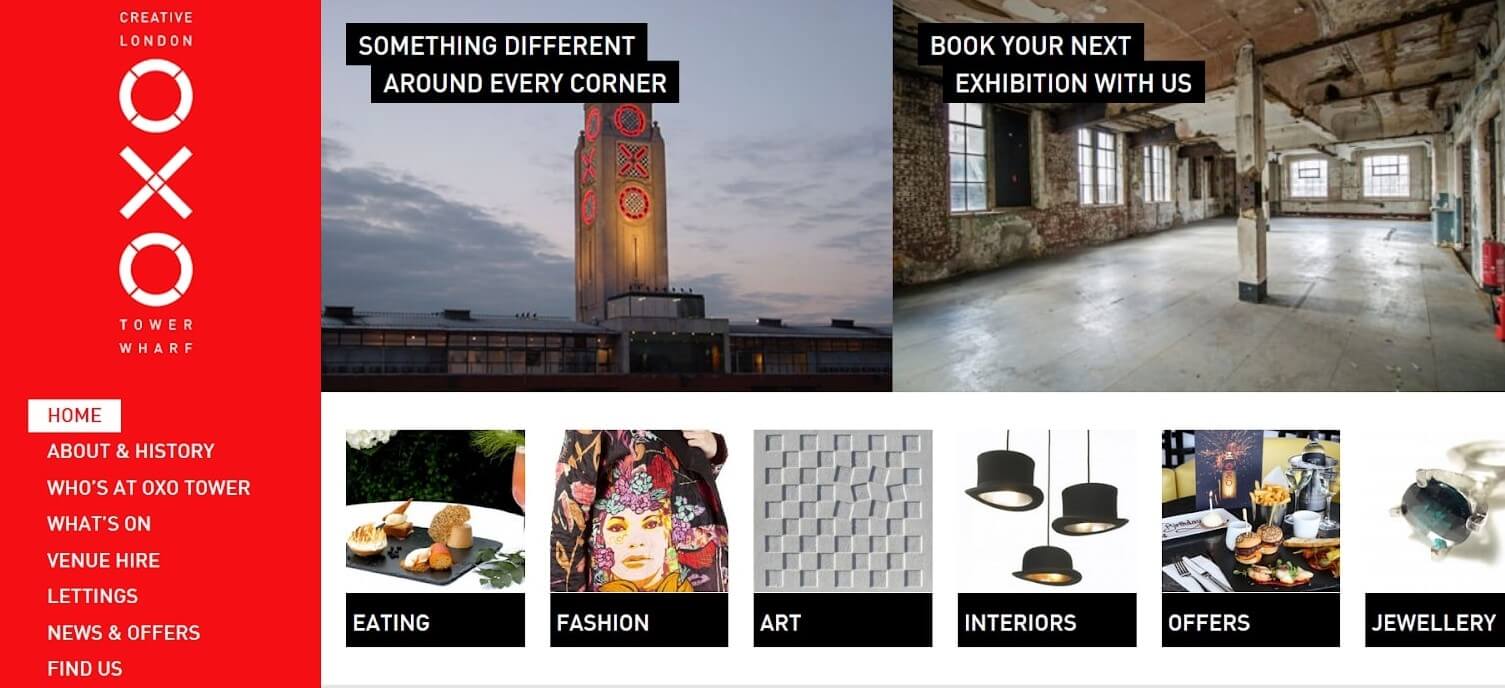
Source: http://www.oxotower.co.uk/
This website has a menu sidebar fixed to the left part of the screen.
A fixed menu bar is an effective navigation tool that guides visitors through the content and helps them find what they’re looking for. It doesn’t force them to go back to the beginning of the page to find the menu. That’s why it’s a great solution for long and content-heavy websites.
Design tips:
- Remember that a fixed menu bar permanently takes up a part of the screen’s space. Make sure that it doesn’t make it difficult to scan through the content of the website.
- Use accurate navigation titles. The menu bar is a form of invitation – it defines the website and gives an overview of what it can offer.
6) Parallax scrolling effect
With this graphic design technique, any website will come alive. The parallax scrolling effect gives viewers a three-dimensional experience.
As you scroll a page down, the background layer moves at a different speed in comparison to foreground images, creating an illusion of depth. No wonder that parallax is derived from the Greek word parallaxis, meaning alteration.
Some websites, like the one below, use this technique so well that they remind living screens rather than static pages. This creates a true movie-like experience.
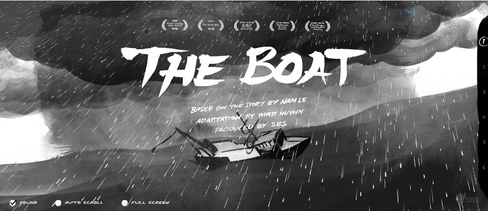
Source: http://www.sbs.com.au/theboat/
This website is an animative adaptation of a short story by Nam Le.
The parallax scrolling effect is a current web design trend that has its origins in classic video games. The website below illustrates how quality design can make websites and brands stick in the viewer’s mind as professional and credible.
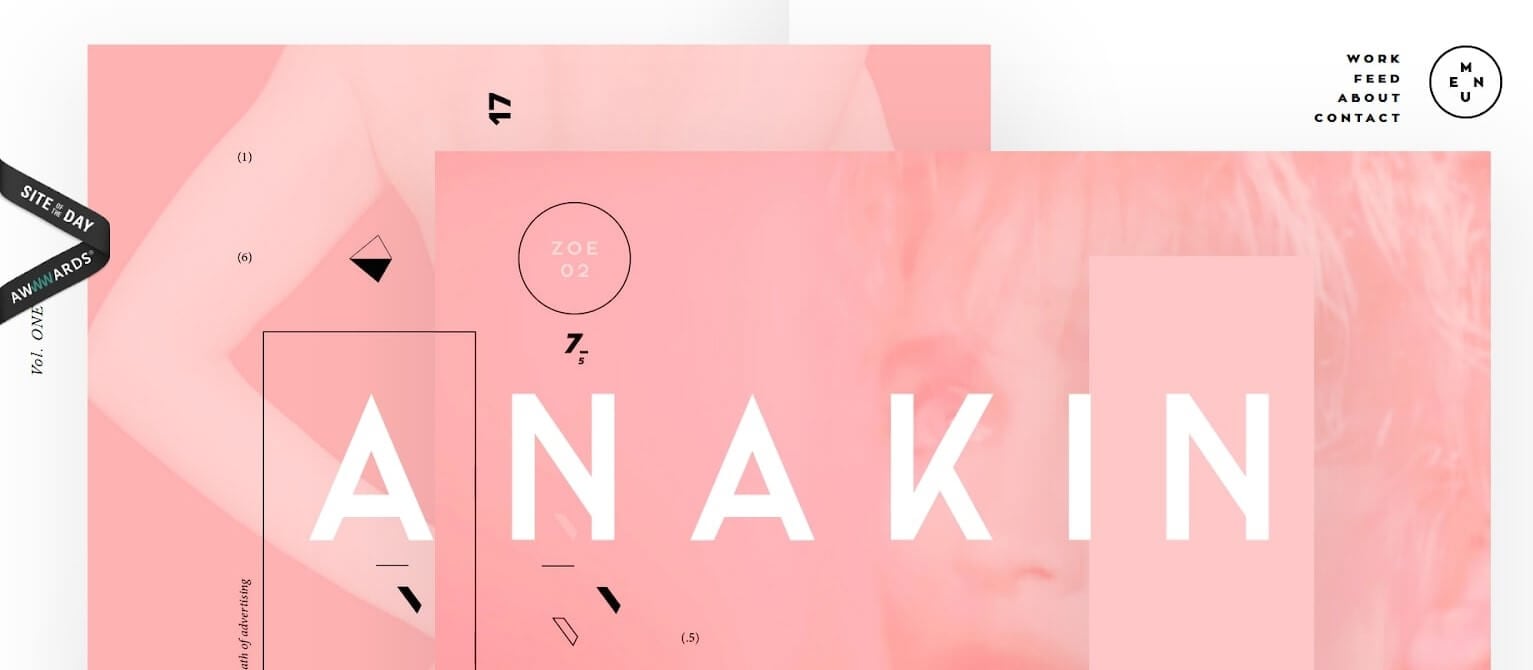
Source: https://www.anakin.co/
The parallax scrolling effect creates a professional image of this design studio..
Design tips:
- Keep a smooth navigation flow to improve the website’s usability.
- Remember that content is more important than style. Don’t distract users with unnecessary animations.
- Endless scrolling can be annoying, especially if the visitor wants to quickly find information. Keep in mind who the website is addressed to.
Creating a positive User Experience is not an easy task.
There are many ways to design a website, but it’s hard to choose the best layout that will satisfy both the functional and psychological needs of target users, and the business needs of the page owner. Hopefully, this article will help and inspire web designers to create even more usable, functional and aesthetic layouts.
See also

Cut2Code Clinches Clutch Global Award
Read article
A Comprehensive Guide to Oxygen: Maximizing Your Web Development Experience.
Read article