
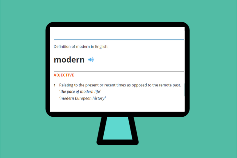
Modern websites have long been a hot topic. Every business and ecommerce owner should make sure that their webpage is up-to-date. Blog titles, agency copy texts, and various IT service descriptions often use “modern websites” as a catchphrase. But what does it actually mean and what makes your website modern? This article, based on the speech I gave at the In Digital Marketing conference in Warsaw, will give you the answer.
Past Meets Present
Let’s start with a bit of history – Bob Dole and Jack Kemp lost to Bill Clinton in the 1996 US presidential election. But still, they were the first ones to use a website for a presidential campaign. Wonder what it looked like? No worries, their page is still running! Everything that amazed Internet users over 20 years ago is still there: Times New Roman as the main font, blue hyperlinks, the “Online Campaign” heading. The site also advertises its interactive sections – visitors can create their own button, download the “Dole for President” wallpaper, and even solve crossword puzzles!

What’s more, Dole’s and Kemp’s website alludes to page cookies, offering a recipe for pecan roll cookies.

As you can notice, the basic elements of the website aren’t that different from what we can see today when surfing on the Internet. Already back then, designers tried their best to smoothly guide users through the page content and direct them to the most interesting sections, although in a less contemporary fashion.
According to what Bill Gates once said, websites are constantly changing. The first-ever 1990s’ websites would now be perceived as primitive.
“There’s no doubt we’ll look back at Web sites today and basically say … that they were quite primitive. They don’t customize what they present to the viewers’ interests. They don’t remember: Have you been there before? What have you seen before? And that’s got to change.”
— Bill Gates, MSNBC, July 15, 1996
Remember about this when you design your page and, whenever possible, make sure to regularly update your website. This is the key step to take if you want your website to be state-of-the-art, not out-of-date.
What Makes Websites Modern?
Many aspects determine whether we could call a given website modern. From design, technological solutions, to the technology used to facilitate purchase decisions – everything is important. To make it easy for you, all these aspects are briefly discussed below.
Design
As the We Are Marketing agency’s website illustrates, the latest trends still focus on minimalism.

When it comes to design, simple graphic forms are usually more common than photos, although it naturally depends on the industry. We Are Marketing uses simple copy and colorful graphic images that clearly inform what the agency has to offer.
Mobile, Mobile, Mobile
Mobile-friendliness is an issue that has been discussed for several years now. Yet it still poses a challenge to many businesses. From our own experience, we advise you to use fluid design to adjust your website to different screen sizes. The opposite of a fluid layout is a breakpoint-based responsive presentation, which imposes more limitations. Remember that the simpler, the better – not only for web developers but also for users.

Fluid vs breakpoint-based responsive presentation
AMP
Accelerated Mobile Pages is a web component framework that allows your page to load even 85% faster than its standard mobile version. AMP loads the entire website content simultaneously, without waiting for any external apps or heavy scripts to download. What’s more, it also optimizes fonts and prioritizes resources by firstly downloading the ones that are the most important for your website. Already 31 million domains are based on Accelerated Mobile Pages (source: searchengineland.com).
One example of the website that successfully implemented AMP is The Washington Post. After introducing AMP, it significantly improved its conversion – the number of returning users increased by 23%. Besides this, the website loads 88% faster than its responsive version without AMP. The website publishing technology played such a big role that 60% of the traffic on The Washington Post website comes from mobile devices!
PWA
Because I raised the subject of mobile responsive design, I also have to mention about PWA (Progressive Web Apps). Although I’m talking about websites, we also have to consider progressive apps, as they’re basically hybrids that merge a website and an app together. To open them, we have to use a web browser. PWA have app-like navigation but also an https protocol. Above this, you can partially use them offline.
PWA are used by such companies like Starbucks (Formidable agency designed and developed the company’s app). Starbucks’ progressive app is only 233 KB, while the native app is 148 MB – that’s a major difference that largely affects the platform’s loading speed and, consequently, the ease with which users can make orders. So with PWA, users can customize their orders offline and make orders online, for example, by comparing product prices from different locations.
What’s more, PWA are gaining more and more users because they get regularly updated. The moment a user visits a page, a progressive app loads content and thanks to its intuitive UI, it’s also very user-friendly.

brainhub.eu
Content
The biggest challenge in preparing content for a modern website is either its enormous size or improper hierarchy, which leads to information overload and tons of text that is difficult to absorb by potential readers. Although we face an excess of content and a small percentage of unique texts, articles are still effective in driving traffic to websites, so their number is constantly growing. Unfortunately, this leads to content duplication and infoglut. With all this data smog, readers have a difficult time finding relevant information.
Nevertheless, a text may still be a force behind, for example, creative forms. In the example below, the designer took shapes, contours and created a visually-brutal form with seemingly messy content.

Do we have to say goodbye to copywriting? No, of course. But we should rather invest in micro-copy that does a better job at facilitating sales, as you can see in the example below. The goal of micro-copy is to create short portions of personalized text, written in the language of potential recipients. Thanks to this, online stores can encourage users to take certain actions.

Video
There has been a lot of discussion about videos in the area of marketing, but in the context of websites – they’re still not used frequently enough. And trust me, it’s worth investing in promotional videos because they can significantly improve online sales. They convey a lot more information in a shorter amount of time and, of course, they allow you to present products in a much more attractive way.

AR
AR (Augmented Reality) enables brands to display virtual products in real-life locations. IKEA is already using this solution; in an app that allows users to see how chosen products will look like in their homes. Thanks to this, the company avoids a number of problems related to choosing product colors or sizes. You know the situations where “it all looked better/different in the store”. Apart from this, using AR in product selling allows clients to save time on making decisions, consulting ideas, and overall communication.

AR is also used by clothing shops. For instance, it enables users to try on shoes without having to leave home.

Even Sephora uses AR, where users can try on make-up by using their smartphone cameras. The brand not only gains clients who are in a hurry and don’t have time to read product descriptions but also saves money on make-up testers.

VR
VR (Virtual Reality) is not only a gaming trend but also the way to create virtual space, where making purchase decisions is much easier for users. Thanks to VR glasses, we’ll soon be able to shop by watching virtual products from store shelves or even try on clothes.
Chatbots
If you’re focused on developing a modern website, another important aspect to consider is personalizing communication with chatbots. Their estimated market value should reach $1,3 billion in the following year! And according to the latest marketing trends, within the next 3 years, 90% of banking operations related to customer service will be automated with the help of chatbots. Chatbots already facilitate:
- lead generation,
- customized shopping,
- ticket booking, flight tracking, as in the example of the Wroclaw Airport.
SEO Has a Voice
Voice assistants, like Siri, Google Voice Assistant, and Alexa are becoming another crucial aspect of client communication. They play the role of a standard search engine but are faster and more precise because they display only several most relevant search results. Right now, they’re the biggest challenge for SEO specialists. More and more emphasis is placed on optimizing websites in the context of voice search, where keywords are taken from everyday speech and questions are based on a natural, more straightforward way of talking. With such optimization, search engine bots are able to select websites with more precision and adjust results to the actual needs of users. This state of affairs is also dictated by the latest Google update called BERT. It forces modern websites to focus on conversational keywords. Grzegorz also mentioned voice search in his article on cart optimization!
The Rules of Modern Websites
In this place, I’d like to lay down a set of compact rules that govern the design of modern websites. Thanks to their help, your website will not only be more user-friendly but also consistent with search engine guidelines.
- Choose readable fonts.
- Use contrasts and appropriate colors.
- Make sure your buttons and form fields are clear and visible.
- Whenever possible, use alt text for images.
- Use fluid layouts.
- Speak in a simple language.
- Design for immersive user journeys, not specific devices.
See also

Cut2Code Clinches Clutch Global Award
Read article
A Comprehensive Guide to Oxygen: Maximizing Your Web Development Experience.
Read article